
MS THERAPY CENTRE RE-BRAND
HERE TO MAKE LIVING WITH MS EASIER
Founded in the 80s by people who suffer with MS, MS Therapy centre Berkshire aim to support people living with Multiple Sclerosis, helping them and their families to live a life that is as easy and comfortable as possible.
We refer to people who use the centre as members not patients, to stop the stigma of people who use the centre being seen as sick.
Offering a range of treatments, from physio and foot care, all the way to offering support and therapies for our members and their families and friends.
CURRENT LOGO
The client stated they feel their logo is outdated where we feel their current logo aligns too closely to the NHS. As a separate organisation, we want a way to differentiate ourselves.
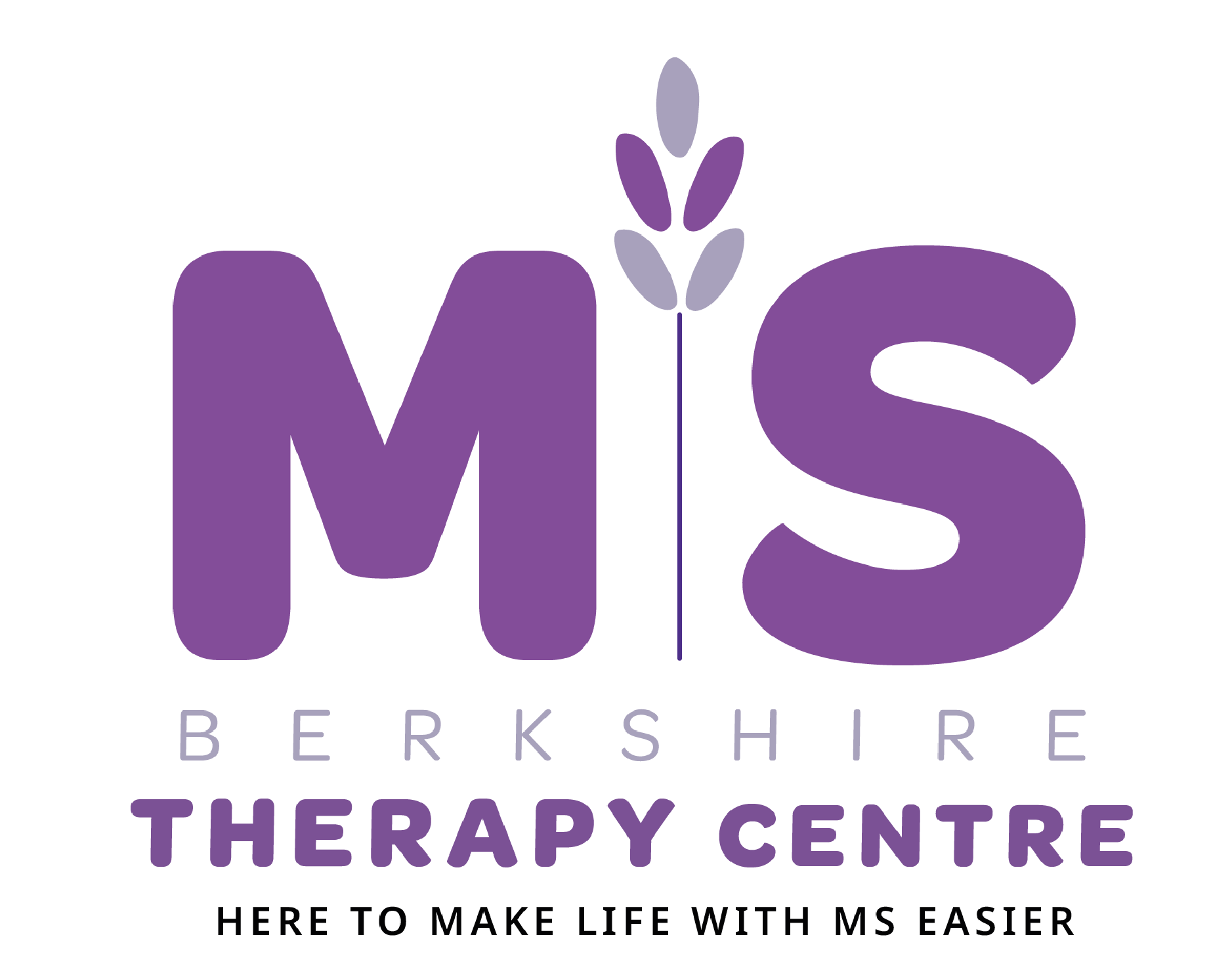
NEW APPROACH
Our logo is the most important asset to the branding of MS Therapy Centre Berkshire.
Here are the displays on how the logo can be used in a variety of situations. Please only use the logos that have been supplied in the MS Therapy centre Berkshire suite.
The logo is symbolic of the kind and welcoming nature the centre provides to our members. Lavender embodies this nature and is a significant smell around the centre to relax our members, hence the use of it in our logo.
NEW WEBSITE
Our website allows for a swift process to making a donation, a process we felt was too prolonged in the previous website, leading to some confusion as to how to donate.
Our new donations page is easy to use, from the home page you select donate, which will take you to the donations page, where you can select to either make a single or monthly payment, choose your amount and pay from a variety of payment options.
SOCIAL MEDIA CAMPAIGN
Our largest social media platform is Facebook with 1.5k followers, this is successful to our current audience as there is already a successful following and consistent strategy. However, with an aim to reach the young audience, we believe Instagram is the ideal platform.
Facebook and Instagram are linked to easy to transfer across. First start with social media strategy for Facebook
For the Instagram we created icons as this is a simple way of communicating information highlights, as its a great opportunity to bring attention to important content.
In keeping with the colour palette for consistency highlights are unique, as whilst they bring attention to the important content, they are still accessible after the 24hr story expiration date.


HANDOUTS
Our leaflets are in a double sided postcard style, this allowing information to be seen easily without having to do any unfolding.
We have one leaflet for our general information about the centre and the services we provide and another leaflet for events, our example being the fun run.
We have reduced our leaflets down to two handouts to keep consistency and reduce the amount of documents we give out.
OTHER OUTPUTS
Our outputs for our event include, money collectors and t-shirts for volunteers, which would also be available for purchase.
Incorporating the lavender elements onto the t-shirt allows for our volunteers to be easily recognisable when working at events, encouraging people to go to them for help and advice.
Having the logo on a tote bag allows us to get the brand out in to society and create more awareness for the charity, alongside selling them for donations to the charity.

